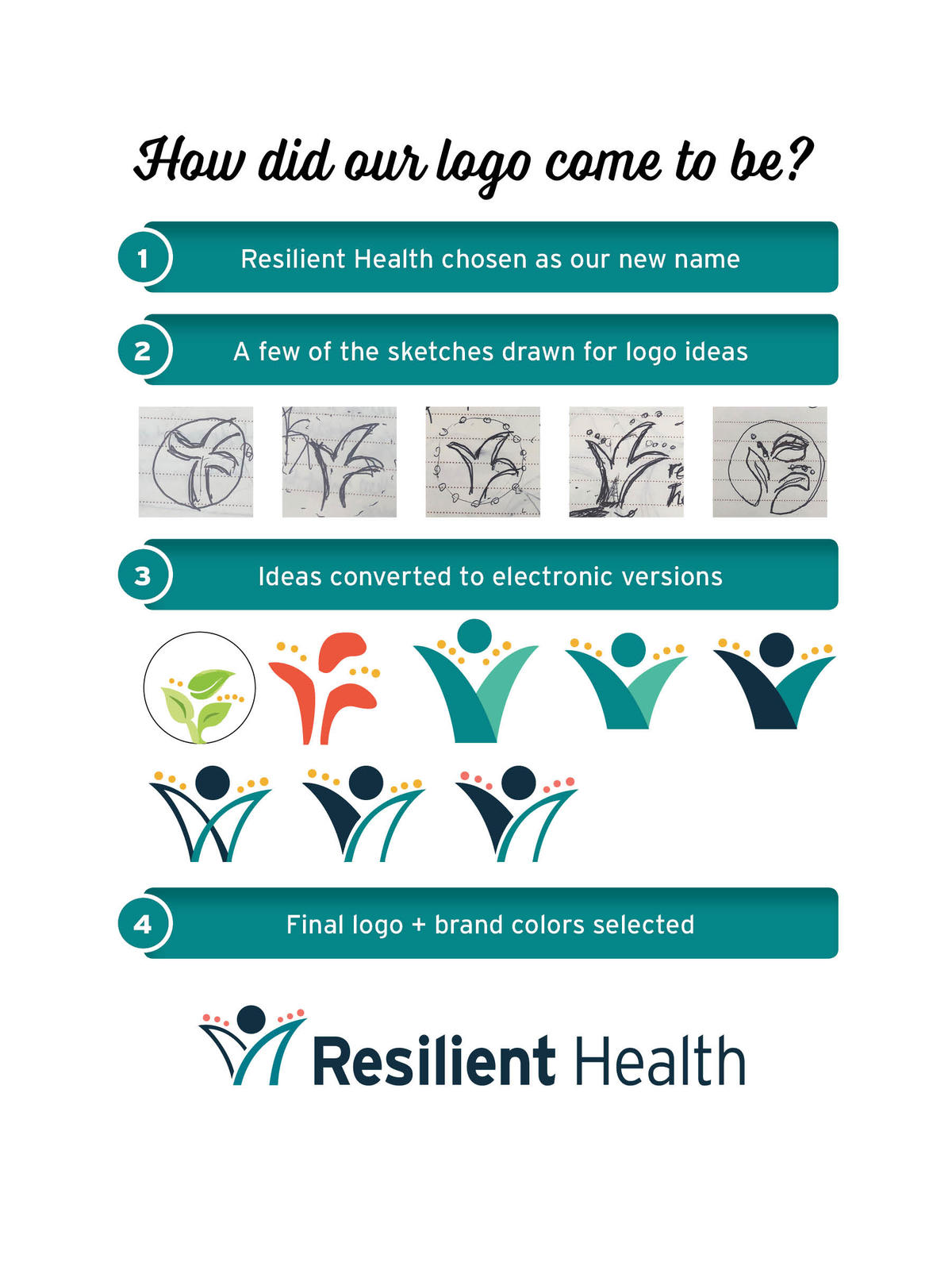
We asked our employees what resilience means to them and had some amazing responses! Some of the words we heard were strength, bouncing back, grit, growth, toughness and adapting. We wanted our new logo to encompass these traits. The coral dots indicate movement and bounce, the dark blue indicates where a person has been (or is currently) and the teal indicates forward motion, growth and the resolve to keep going. The teal area is a stronger element than the dark blue side because we truly believe that learning resiliency-building skills will lead to more successful lives. So what is it? We’ve heard that some people see a flower, a leaf, or a person, and others just see the movement and growth within the logo. We’re happy with all versions of this… after all, resilience is personal!
Resilient Health offers a trauma-responsive experience that provides both verbal and non-verbal therapies/counseling for mental health and substance use disorders, wellness classes, therapeutic arts and art therapy through its Art Awakenings service, psychiatric, housing, respite, early intervention (first episode psychosis), primary care and medication management. The name change helps to reposition the company and better align it with its core purpose.
Our purpose is to unleash the power of our employees and participants to create a resilient world, one person at a time.
It is important for us that each person who walks through our doors walks back out with tools that will help them continue to succeed in life.
Resilient Health Administrative Office
2255 W Northern Avenue
Phoenix, Arizona 85021
877.779.2470
602.995.1767
Copyright © 2024 Resilient Health. Policies